01 — STARTLINE

ROLE
Independent concept · Solo product designer · AI Experience · UX Strategy · Information Architecture · Design Systems
TOOLS
Claude · Figma · ChatGPT · Adobe Creative Suite
THE PROJECT
Project overview
Independent concept · Solo product designer · 2026. I designed Startline to help newcomers identify one trustworthy next step across fragmented settlement systems. Deliverables include research framing, information architecture, end-to-end flows, a source-aware AI interaction model, reusable Figma components, and a test-ready prototype.
Startline explores how a digital product can reduce that uncertainty by combining structured settlement resources, human support, and transparent AI assistance.
My focus wasn’t simply making information easier to find. It was designing the decision-making experience around it.
See Startline in motion
Figma prototype walkthrough · 24-second highlight. Explore next steps, discover local support, and check service information before acting.
The problem: resources without a clear path
Settlement information is spread across government websites, service organizations, and informal advice. Finding a resource is only part of the work. People also need to understand whether it applies to their status, province, household, and stage of arrival.
I framed the design challenge around sequencing: how might Startline help someone act on the right information without asking them to understand the whole settlement system first?
Research framing and working insights
This version draws on secondary research and design exploration. The insights below are working hypotheses to test with newcomers and settlement workers. Primary interviews and usability outcomes are not presented as completed evidence.
Three signals shaped the direction: information is fragmented; every settlement journey depends on context; and trust requires visible provenance. Together, they suggested that a useful next step matters more than an exhaustive directory. Amina and David served as proto-personas for exploring different priorities, not as validated participant profiles.
Product strategy: make the next step clear
Understand → Prioritize → Act → Progress. Onboarding captures the context needed for a first path. Home prioritizes one action. Task details explain what is needed and where to go. Completion returns the user to an updated journey.
The core loop takes priority over broader expansion. Voice support, deeper localization, document reminders, and settlement-worker tools remain future opportunities. This keeps the first usability study focused on whether people understand what comes next.
Information architecture
Five stable destinations give the changing recommendations a predictable home: Home for the immediate priority; My Path for the wider roadmap; Ask Startline for explanations; Resources for official information and services; and Profile for personal context and preferences.
AI is available both globally and beside a task or resource. That lets people ask for help at the point of uncertainty without abandoning the action they were trying to complete.
Designing AI people can understand and trust
The challenge wasn’t simply getting AI to generate an answer. It was deciding how much authority the system should have.
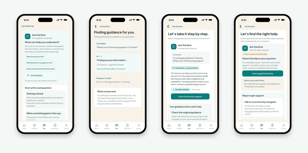
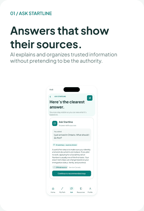
I designed the interaction around three principles: explain the recommendation, show where information comes from, and give the user a clear path to human help when the decision is high-stakes or uncertain. ASK → UNDERSTAND → EXPLAIN → VERIFY → ACT
A calm identity and a reusable system
The Pathmark pairs a starting dot with teal and sand ribbons that form a continuous route. Plus Jakarta Sans, soft neutrals, restrained elevation, and generous space give the product a reassuring tone.
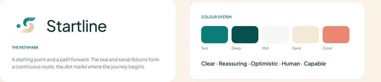
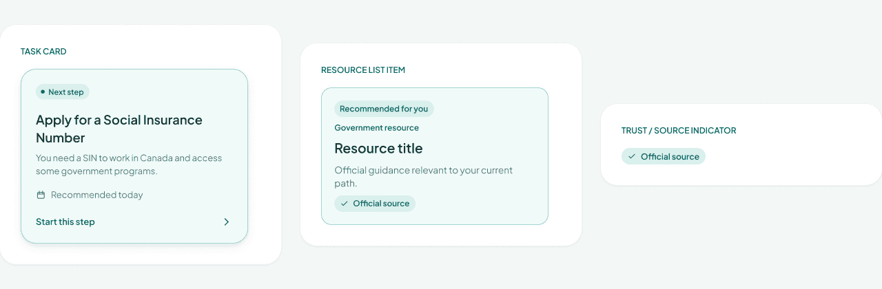
Semantic tokens and reusable buttons, fields, task cards, resource cards, source indicators, and navigation patterns keep the experience consistent. The system is organized around actions and trust states, so the same visual language carries from a recommendation to a sourced answer.
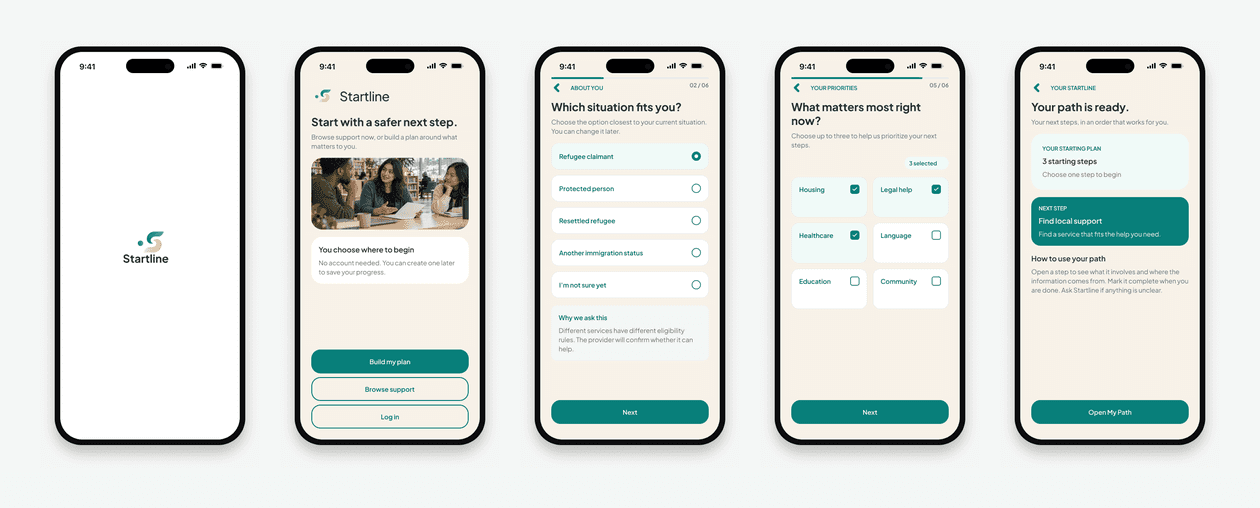
01 / Onboarding → a personalized path
Language, status, location, household, and priorities shape the first recommendations. Short steps and a review stage keep the process understandable, while the path-ready screen explains what the user gets in return.
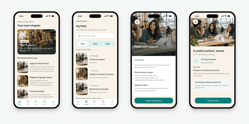
02 / Home → task → progress
Home leads with one priority. My Path keeps the wider sequence visible. A task explains what is needed, points to the source, and offers contextual help. Completion confirms the action and presents the next step, so progress never ends in a dead end.
03 / Resource discovery → verified help
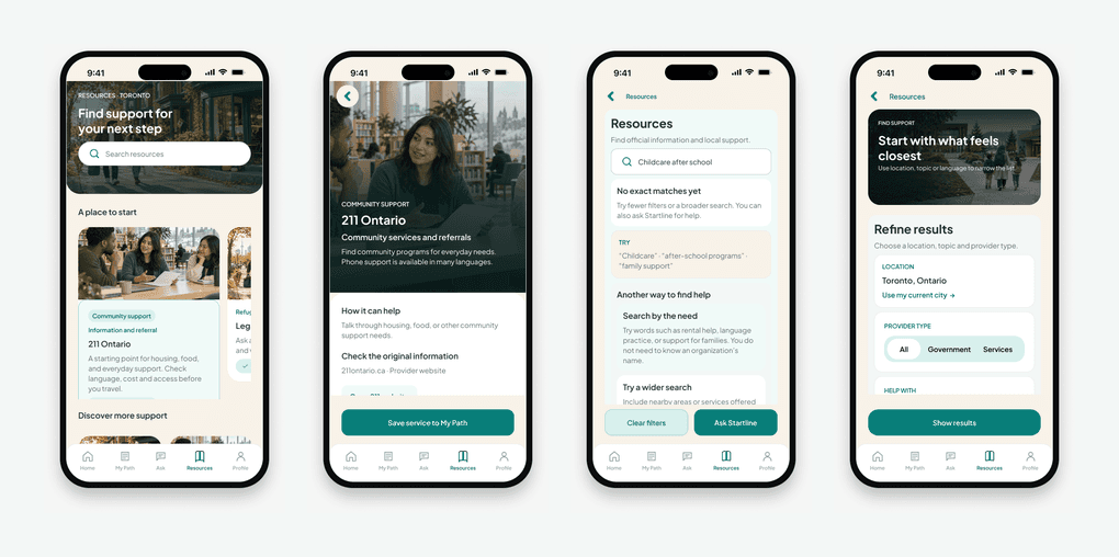
Search and filters narrow results by need and location. Official information and service listings receive distinct source treatments, and resource details preserve provenance. An empty-result state offers recovery instead of leaving people to restart.
04 / Ask → sources → human help
The conversation starts with a plain-language question, shows a checking state, and returns a concise explanation with visible sources. When the question needs individual judgment, the flow makes the handoff to official or human help explicit.
Prototype coverage, not product impact
The final build audit recorded 51 screens, 132 interactions, all 51 screens reachable, and no broken prototype destinations. These are prototype coverage metrics, not evidence of improved settlement outcomes or live-product performance.
The prototype covers onboarding, tasks, resources, AI help, and profile settings. Some search, filter, and selection states are demonstrated through predefined screens. Before testing, those interactions need enough statefulness to support realistic tasks.
Validation plan
Recruit a small first round of newcomers and settlement workers. Ask participants to create a path, identify their next step, complete a task, find a relevant resource, inspect an AI source, and seek human help when the answer is uncertain.
Observe task completion, hesitation, backtracking, source recognition, and whether participants can explain the recommended next action in their own words. Use the findings to revise prioritization, navigation, and trust language before expanding the screen set.
Reflection: validate earlier, scale later
The strongest decision was organizing the experience around one useful next step. The clearest lesson was that the screen set grew faster than the evidence. Next time, I would test a smaller core journey, map back navigation before high fidelity, and formalize components after the main patterns have been tested.
Larger-text examples, alternate appearances, and a tablet Resources view now support design review. Longer translations, reduced motion, assistive technology, and color-independent status cues still need implementation testing. A component library is a foundation for that work, not a substitute for testing it.
From product to presentation
Laptop and iPhone compositions extend the product story into a launch page. Social concepts focus on the same promise—one clear next step—and show the real interface. The selected marketing examples below keep the brand consistent across touchpoints.
Latest refinement: clearer actions, more room for content
I strengthened navigation labels and selected states, removed redundant outer panels, and brought useful service information higher on the screen. Bounded scrolling areas and fixed-action clearance keep long resources and answers readable. On tablet, Resources becomes a list-and-detail layout with independent scrolling, so the wider window adds context rather than simply enlarging the phone.
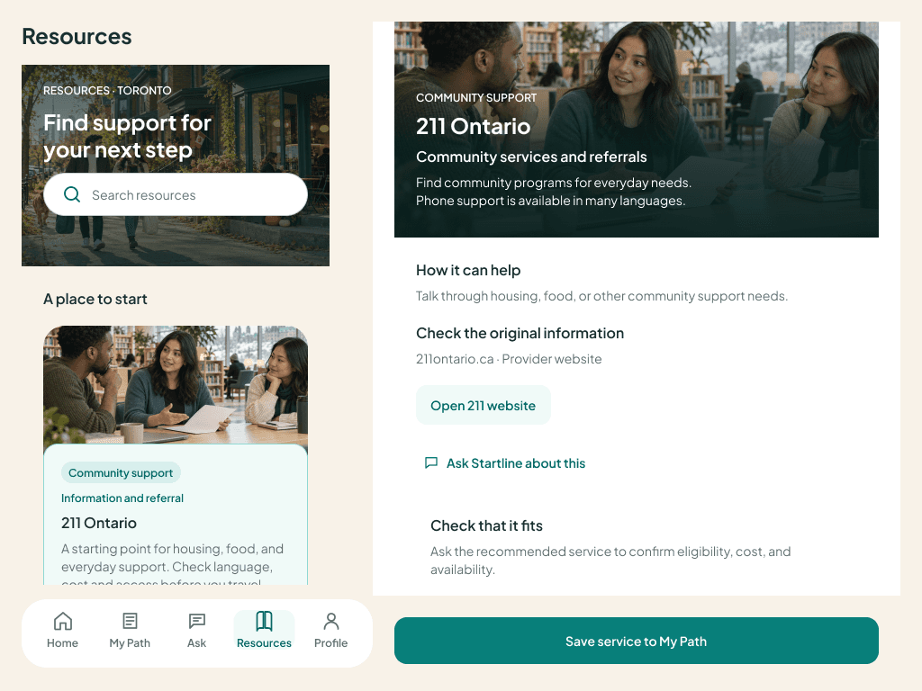
Figma scrolling and cross-navigation were exercised. In the separate web preview, keyboard navigation, labeled preference switches, extra-large text wrapping, and preference persistence were checked. The review also found unfinished heading semantics, navigation state announcements, and contrast differences between the web preview and Figma. Those remain implementation issues; this is not a claim of complete runtime accessibility.


© 2026 Michael Ajibola