02 — MERCADO

ROLE
Independent concept · Solo product designer · Marketplace · Design Systems · Interaction Design
TOOLS
Claude · Figma · ChatGPT · Adobe Creative Suite
THE PROJECT
Project overview
Independent concept · Solo product designer · 2026. I designed Mercado as a connected two-sided marketplace spanning discovery, negotiation, listing, checkout, and fulfilment. Deliverables include architecture, flows, wireframes, high-fidelity UI, a reusable design system, and an interactive prototype for usability testing and implementation discussion.
The design challenge
The design challenge wasn’t one interface. It was keeping two different user journeys connected through a shared transaction system.
Mercado explores how these moments can form one coherent mobile journey. The project’s working hypothesis is that clear handoffs between discovery, negotiation, and fulfilment can reduce uncertainty. This is a design hypothesis; no measured user outcomes are claimed.
Strategy: connect the whole transaction
The MVP brings local discovery, seller information, offers, checkout, pickup or delivery, and messaging into the same product. Each journey has a clear destination: buyers reach an order confirmation; sellers reach a listing preview and publication; conversations carry an offer toward the transaction.
My contribution spans brand direction, semantic tokens, reusable components, information architecture, flows, wireframes, high-fidelity UI, and prototyping. The prototype is a designed demonstration rather than a functioning marketplace or payment service.
An architecture for both sides of the market
Discover contains Home, search, filters, categories, and listing details. Buy connects seller profiles, offers, checkout, fulfilment, payment, and confirmation. Sell breaks listing creation into photos, details, price, delivery, and preview. Messages supports questions, negotiation, and order updates. Account brings saved items, orders, listings, verification, and settings together.
The structure keeps buying and selling connected through the listing and conversation, while giving each its own sequence. This allows the same person to move between buyer and seller roles without learning two separate products.
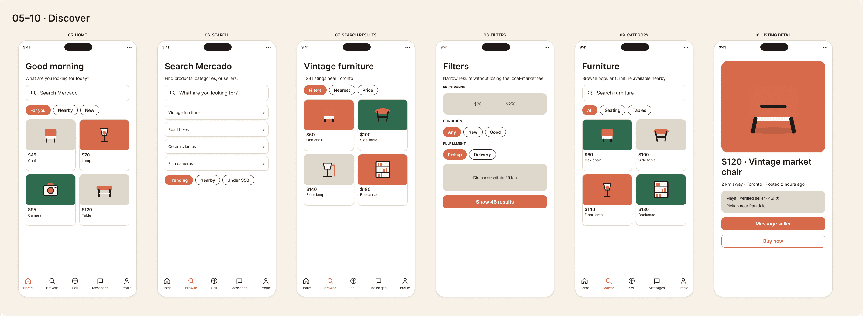
01 / Discover something nearby
Home and category screens lead with the product, price, and local context. Search suggestions help people begin, while filters refine by price, condition, fulfilment, and distance. Listing details then bring the item, seller cues, and next actions together.
02 / Move from interest to agreement
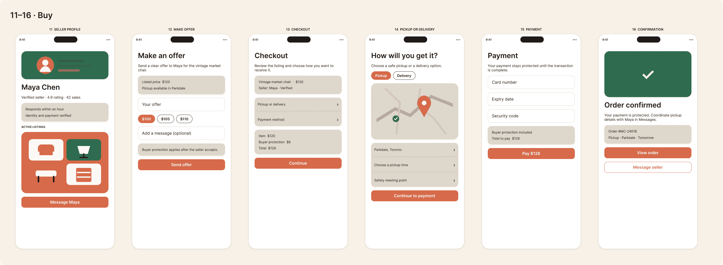
The purchase journey connects seller information and offers to checkout. Pickup or delivery is an explicit choice before payment and confirmation. Keeping those decisions visible gives the transaction a clear sequence rather than leaving logistics to an unstructured exchange.
Seller verification and review cues are interface concepts that need testing for comprehension and credibility. A production version would also need defined verification, dispute, payment, and fulfilment policies behind those cues.
03 / List an item and keep the conversation moving
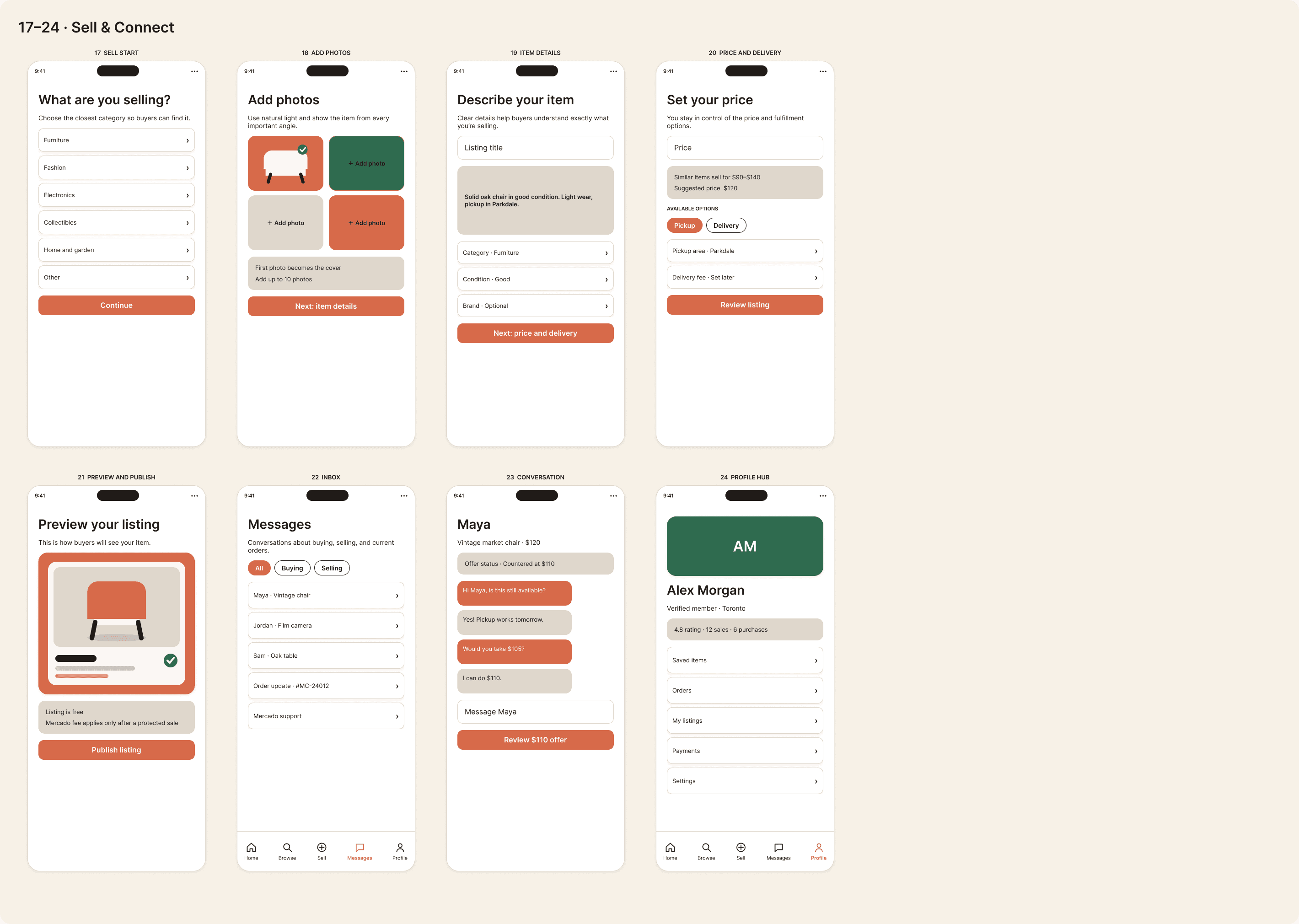
Selling is separated into manageable steps: start a listing, add photos, describe the item, set price and fulfilment, then preview and publish. The preview gives sellers a chance to check what buyers will see before the listing goes live.
Inbox and conversation screens keep questions and offers close to the item. The profile hub provides a home for saved items, orders, and active listings, so transaction activity has a predictable place to return to.
A warm identity with a systematic foundation
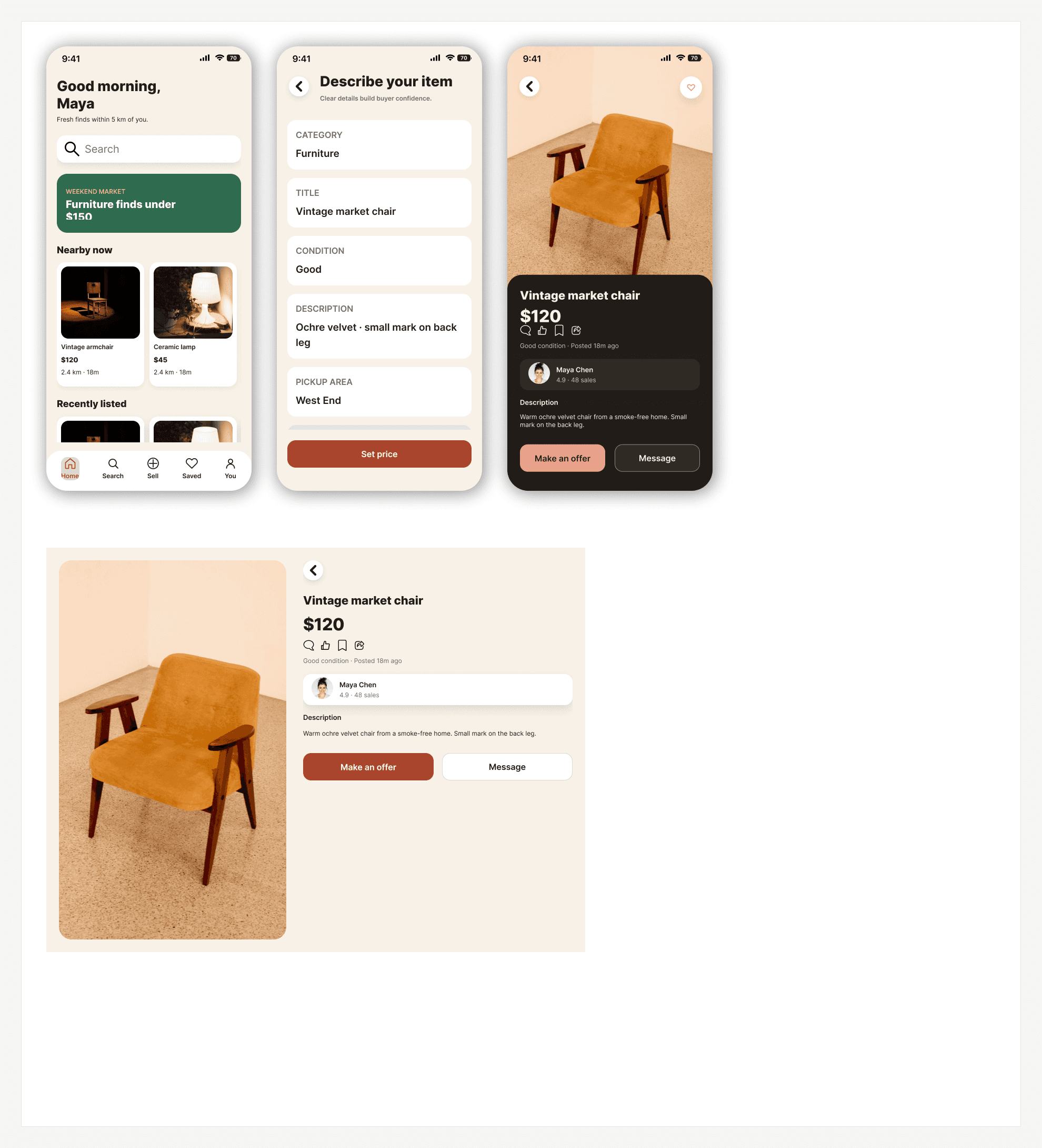
The approved terracotta palette gives Mercado a warm, recognizable identity, supported by neutral surfaces, Inter typography, and product illustrations. The brand promise—“Everything has a market.”—carries through the wordmark and mobile experience.
The reusable system connects semantic color roles, typography, spacing, and component-specific shapes. The latest refinement added pressed and focus states, strengthened action and navigation contrast, and reviewed larger text and alternate appearances without replacing Mercado’s warm identity.
Prototype and next validation step
The latest Figma review exercised the buying journey through offer, checkout, payment demonstration, and confirmation, plus the selling journey through photos, listing details, price, preview, and sample publication. Back navigation and scrolling were checked; a main mobile-screen audit found no invalid destinations. These are prototype checks, not completed transactions or measured user outcomes.
Next, test these journeys with participants: find and evaluate a local listing, make an offer and choose fulfilment, and publish a listing. Observe hesitation, interpretation of seller cues, and recovery after changing a decision. Runtime accessibility remains to be verified in an implemented app.
Reflection
Mercado’s strongest foundation is the connection between product architecture and reusable UI. The next opportunity is to validate the small decisions within that system: which listing details establish confidence, when negotiation should lead into checkout, and how clearly the interface explains pickup or delivery.
A polished screen set makes those questions concrete. Testing them is what will determine which patterns deserve to scale.
Latest refinement: hierarchy, states, and adaptation
“Make offer” now leads while messaging stays secondary. I restored missing listing fields, improved caption size and leading, coordinated listing imagery through the transaction, and darkened action color for stronger white-text contrast. Pressed, focus, and disabled states make the component system more complete. Larger-text, dark, increased-contrast, and tablet examples test how the structure behaves beyond the default mobile screen.
© 2026 Michael Ajibola