COCOCOIN — BUDGETING

THE PROJECT
Project overview
Cococoin is a personal budgeting companion for iOS, mobile web, and desktop. I worked on research synthesis, information architecture, monthly planning, activity and savings flows, reusable components, and prototypes. The experience uses sample financial data; saving a plan does not move money.
Research into decisions
Three participant interviews informed the direction: distinguish spending room from upcoming commitments, allow income and allocations to change, and make savings progress quick to read with reminders under the user’s control. This small sample provided direction rather than population-wide conclusions.
One clear planning sequence
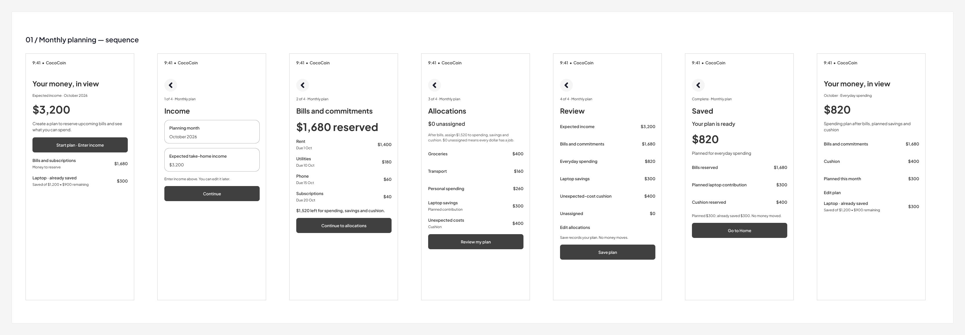
Home → Income → Bills → Allocations → Review → Saved → Updated Home. Each step makes the next decision explicit. Income can be estimated, bills are reserved before allocations, and review explains the remaining amount before saving. Unsaved-change recovery lets people keep editing or discard deliberately.
What testing changed
Three participants tested five tasks in the seven-screen iOS planning prototype. The sessions revealed confusion about remaining money, whether saving transferred funds, and the difference between planned contributions and money already saved. I clarified allocation totals, changed the action to “Save plan” with an explanation that no money moves, separated planned from already-saved amounts, and made income entry more explicit. These changes have not yet been retested for effectiveness.
A coherent system across contexts
Cobalt, ink, mist, and white support clear financial roles. Captions gained more leading; redundant profile panels were removed; pressed, focused, and disabled button states were completed; and destructive actions were separated from the primary recovery action. Larger-text, dark, and increased-contrast examples make the design testable beyond its default appearance.
Tablet adaptation changes the structure: persistent navigation, a two-column metric summary, stacked charts, and a horizontally scrollable transaction table. It uses the extra width for context while keeping a readable order.
Verification and next step
The Figma planning and unsaved-change journeys were exercised, along with larger-text scrolling and the tablet transaction table. A link audit found no destinations outside the final screen set. These checks establish prototype behavior, not accessibility in a running app. Next, retest the revised planning language with participants and verify assistive technology, keyboard access, and text scaling in implementation.

© 2026 Michael Ajibola